The most deceptively simple but essential art in comics is lettering: or, the speech bubbles. Lettering, sometimes called bubbling, is an entire system of comic book grammar with its own set of own rules, nuances, and pitfalls. You can read more about it here, but I’ll summarize some of the basics, and how they’ve influenced my work this summer.
Comics fonts are generally sans serif, chosen for legibility. One speech bubble shouldn’t hold more than two sentences, but multiple balloons can be conjoined to convey a longer thought process. Within a bubble, lines of text should be arranged by line breadth into an ovular shape, broadening and then tapering, like so:
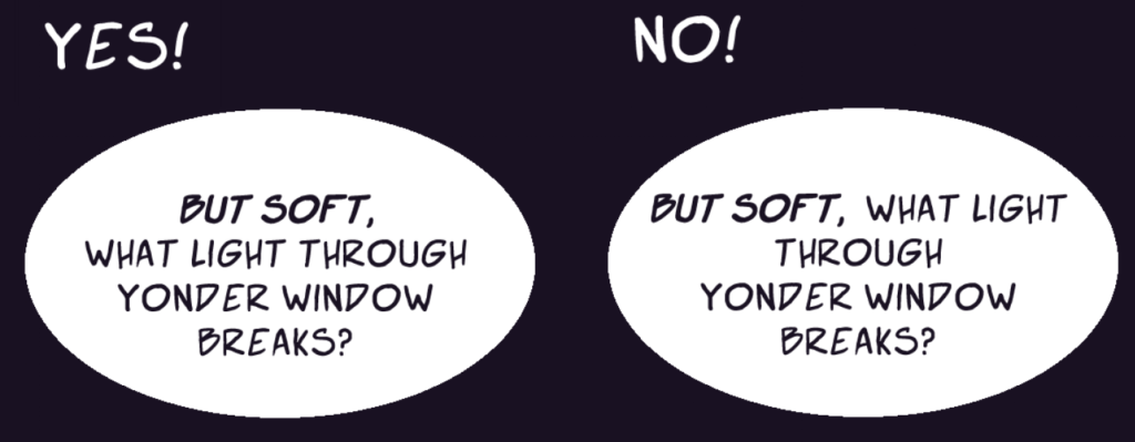
This way, comics chunk text into visually appealing, bite-sized bubbles, which string together into complex conversations. The organization of bubbles on a page is essential to the dialogue’s flow.
In comics adaptations of Shakespeare, however, letterers are faced with a unique conundrum: how do you squeeze long, winding, unwieldy iambic pentameter lines into speech bubbles?
In the (lots and lots) of Shakespeare comics I’ve read, I’ve seen a variety of approaches. The most straightforward is to just transplant the original text, relatively unchanged from how it would appear in a printed edition of the play, into a comic book. Below is an example of this approach from Shakespeare Comic Books Co.’s Romeo & Juliet:
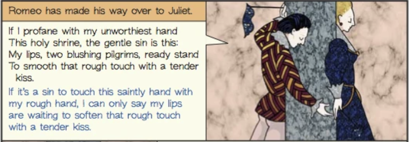
Of course, this approach isn’t necessarily wrong! This particular comic is explicitly designed as a pedagogical tool for introducing Shakespeare to new readers, and its layout—original text above, translation below—reflects and serves that purpose. However, because it doesn’t really follow comics grammar, the resulting book reads more like an illustrated version of Romeo and Juliet than a full comics adaptation: the speech bubbles are rectangular, the text within arranged like a paragraph, and the text and image are heavily partitioned instead of interplaying.
Gareth Hinds’s adaptation of Romeo and Juliet moves more towards adapting Shakespeare for comics grammar:
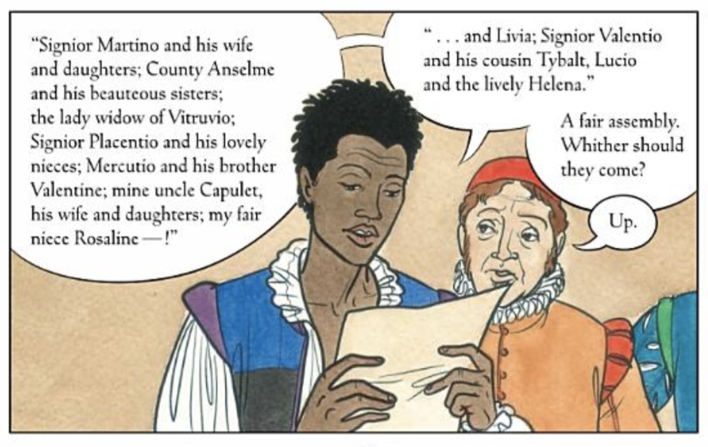
Here, Hinds’s speech bubbles interact directly with his (incredible!) watercolor drawings. Note how Romeo’s hair overlaps his speech bubble, and how Peter’s hat is partially blocked; it really feels like the text inhabits the same world as the images. Peter’s speech bubble also nicely creeps into Romeo’s, a small detail to aid the conversation’s flow. However, the text itself is still decidedly rectangular, hugging panels’ right angles, and there’s a relatively high text-to-page ratio. Again, this isn’t necessarily a bad thing, but it does deviate from comics grammar.
Finally, there’s Classical Comics’ Romeo and Juliet, with lettering by Jim Campbell:
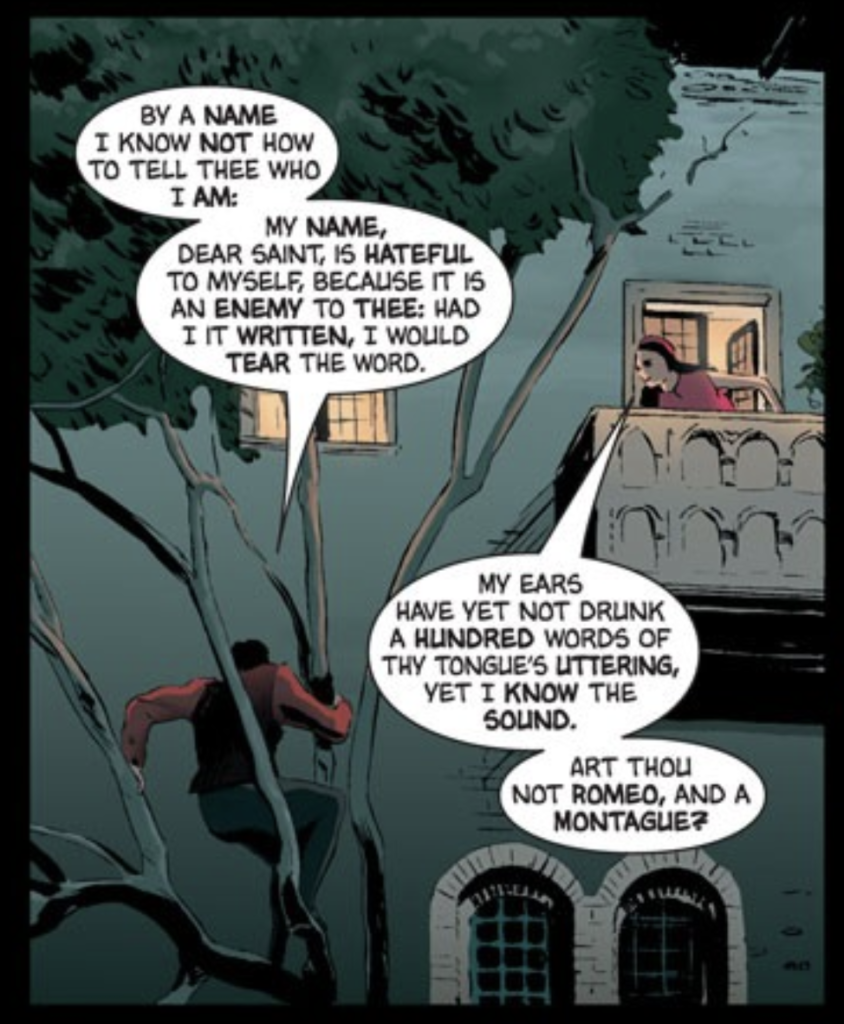
This is the only book so far with a designated (or at least credited) letterer, and Campbell’s understanding of comic book grammar is on display on every page. Here, he splits Romeo’s first line between two thought bubbles and divides them at the colon (“who I am:…”), an intuitive break. The text is legible, skillfully chunked, and beautifully shaped. This example also is the first book listed here to incorporate and visualize the iambic pentameter; Campbell bolds some of the words in positions of stress (“My name“)! It’s really brilliant stuff.
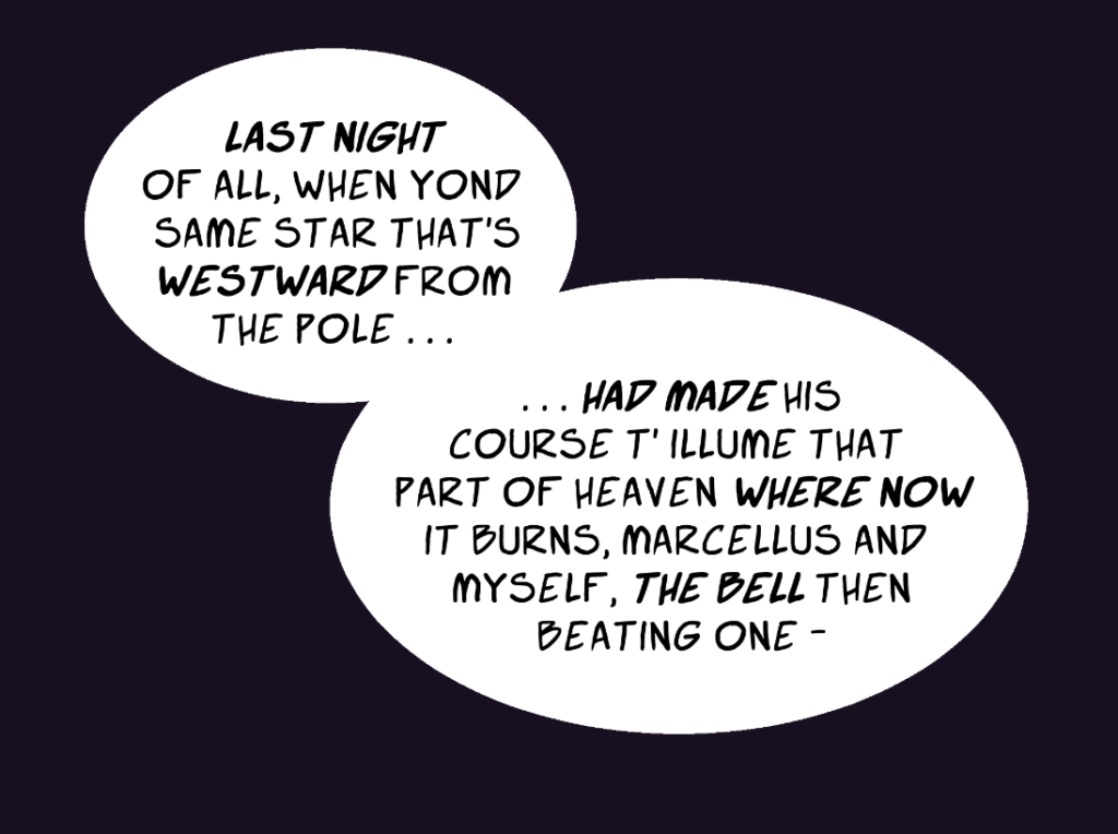
However, there is one piece of information that gets lost in translation here: the line breaks. Iambic pentameter is broken into lines of ten syllables, or five metrical feet. Line breaks are really important when you’re analyzing Shakespeare. The word a line ends on, for example, is usually key; you can get the gist of Hamlet’s most famous monologue just by the last word of every line (question, suffer, fortune, troubles, sleep…). But the process of reshaping text for speech bubbles, from paragraphs into ovals, removes all of the line breaks. For my graphic novel adaptation fo Hamlet, then, how could I keep that textual information in speech bubble form?
My solution, inspired by all of the examples I’ve seen, is this: I mark every new line by bolding the first iamb (or, if the iamb is a fragment, the first two words of every line). I think this approach both abides by comic book grammar while retaining the maximum amount of original information from Shakespeare’s poetry. It looks like this:
