After a month, I’m now 21 pages into my graphic novel. Hopefully, the prologue and first dozen-something pages will have been the hardest (and most time-consuming), since they carry the unique burden of establishing the tone and visual aesthetic for the rest of the story. There’s so much foundational work in those opening shots—first words, first looks, first impressions.
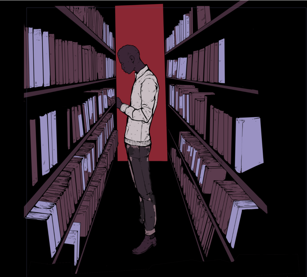
A large amount of the work in these early stages has been around establishing the story’s basic visual motifs. Symbolism isn’t an exact science or anything, but I do have a list of building blocks to work with and fall back on—a kind of iconographic palette. From the the play Hamlet, I took inspiration from mirrors (“mirror up to nature”), birds (“providence in the fall of a sparrow”), and the ocean (“sea of troubles”). Those three concepts show up in illustrations and can combine into new images, like the ocean as a reflective surface, or a character drowning in a mirror. The mirror image also gradually expanded to include stained glass windows, which I draw a lot of at Wittenberg, Hamlet’s school.
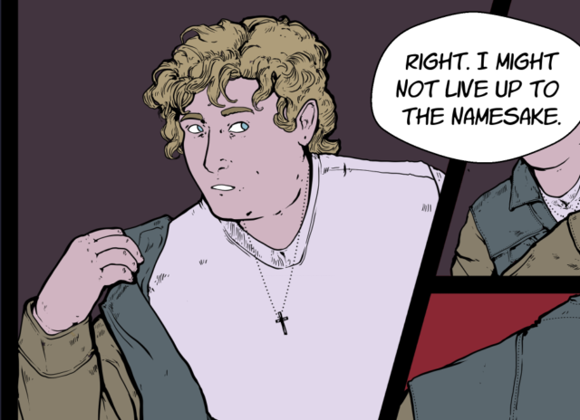
Other visual information I rely on is color symbolism. Each character corresponds to a different color: Hamlet is red, and Ophelia, yellow; Laertes, blue; Polonius, green; and so on. But that color coordination is trivial until it’s put into context. Then, it can express a lot—like the characters relationships or power dynamics. When Ophelia is independent from her father, for instance, she wears her own signature color, yellow; but when she returns to Elsinore and his parental control, changes into his, green, instead. It also infiltrates and shapes the comic in more subtle ways, like when Horatio first meets Hamlet, and the event is marked with a stripe of red before his entrance:
So, the background color of any particular page isn’t necessarily realistic. Instead, it’s a manifestation of the characters’ emotional situation: who’s in control, who’s influencing who. (This also just makes for more dramatic color palettes!)
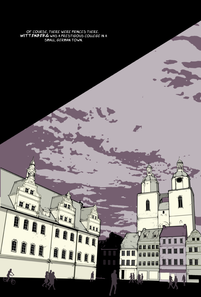
Outside of its visuals, the graphic novel has also involved a lot of background research. It straddles a weird line between anachronism (it’s a 1601 play set in the 1970s, after all) and historical grounding. Over the last month, these pages have demanded a pretty broad range of reading, research, and rummaging for trivia: on Scandinavian rock bands of the late ‘70s, remote ski resorts for Europe’s elite, conversational Danish, Kierkegaard, Yeats, Augusto Boal, Pascal’s Wager, the death of Tycho Brahe, the conversation rate from pounds to krone, and the cost of a train ticket from Copenhagen to Elsinore.
Jules! These are beautiful! I cannot wait to see what it becomes! The attention to detail of color while also considering how colors interact with character motives/relationships make for such a fun visual experience! I like the idea that the your identity or notion of self shifts between people and contexts because that’s actually what happens rather than a static color/personality. The fandom of your work (to which now I am the moderator of now) loves a good easter egg/continuity.